
Fake pictures of earth
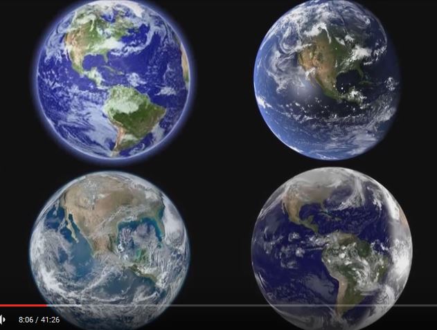
Here are four images of the earth; I’ll label them A, B, C, D, starting from the top left to right, then the bottom left to right.
Photo A: The tip of South America leaves no room for the ocean and Antarctic, which is beneath it.
Photo B: Where South America is suppose to be, you see a lot of blue – which indicated the ocean. So, where is the land?
Photo C: Look at how huge the US is – there is no room for Canada and Alaska! There also is no room for South America.
Photo D: Again, it looks like there is no room for Canada and Alaska. Also look at the right side of the photo and how much brighter it is; there seems to be a marked contracts line. In reality, there should be gradual darkness. In this bright area, there is also a “hot spot.” This only happens when the light source is close. This is not how daylight is on the earth.
If someone says these pictures are not from satellites but are computer generated images (CGI), then there is still something wrong. First, if they are CGI why use them? After all, we have thousands of satellites not to mention the space station that can take pictures, so there is no need to resort to Photoshop images. But if they are CGI, why can’t the computer graphic artists do a decent job, as this is easy to do. No, what you see is different proportions of continents to the circumference of the earth.
So, why are these crappy pictures used? My thought is, that people are being sick and tired of the lies the Federal Government tells people, and they know what happens to whistle-blowers. Many of these people either lose their jobs and lose their chance of being hired elsewhere. They also know that some whistle-blowers end up dead. Since people have to eat and support their family they figure it’s better to “do their job;” they do it in such a way to tell others without losing their jobs. They hope that intelligent people can see the mistakes with the hope that the public wakes up.
Have these photos woken you up?
